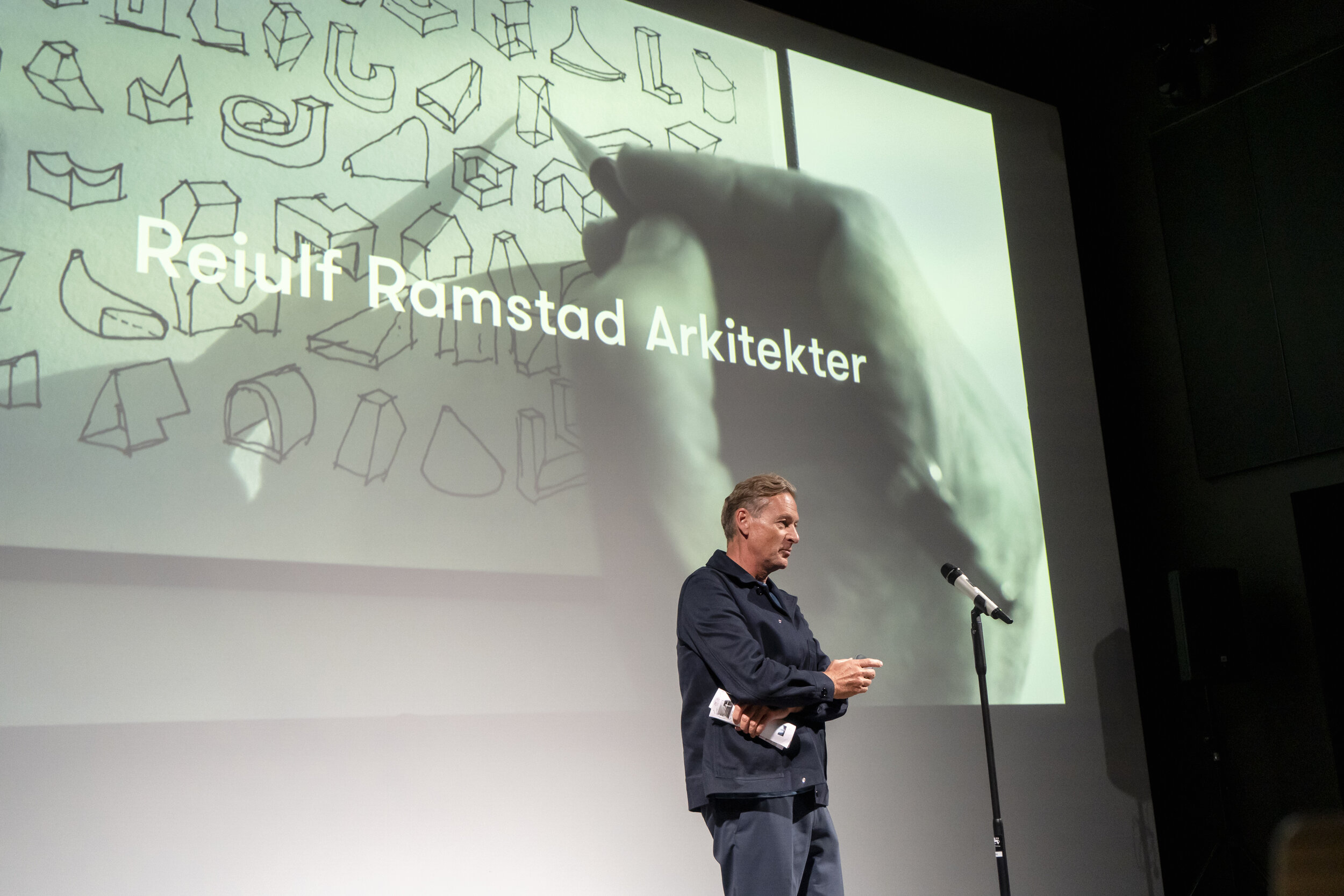
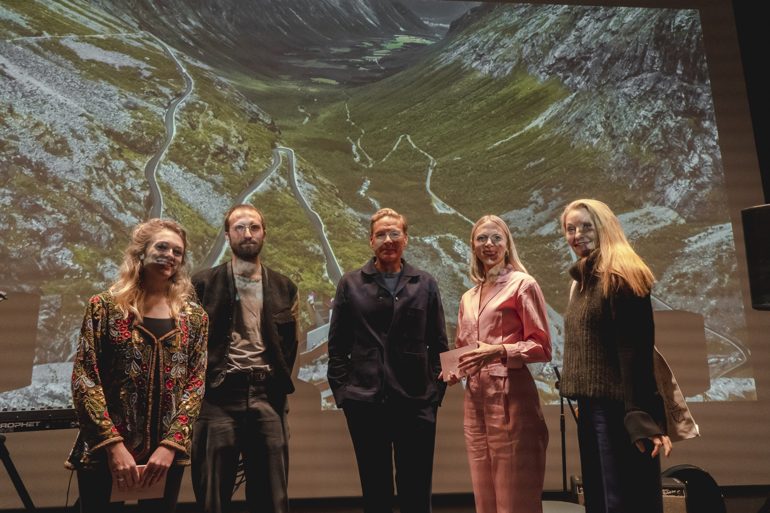
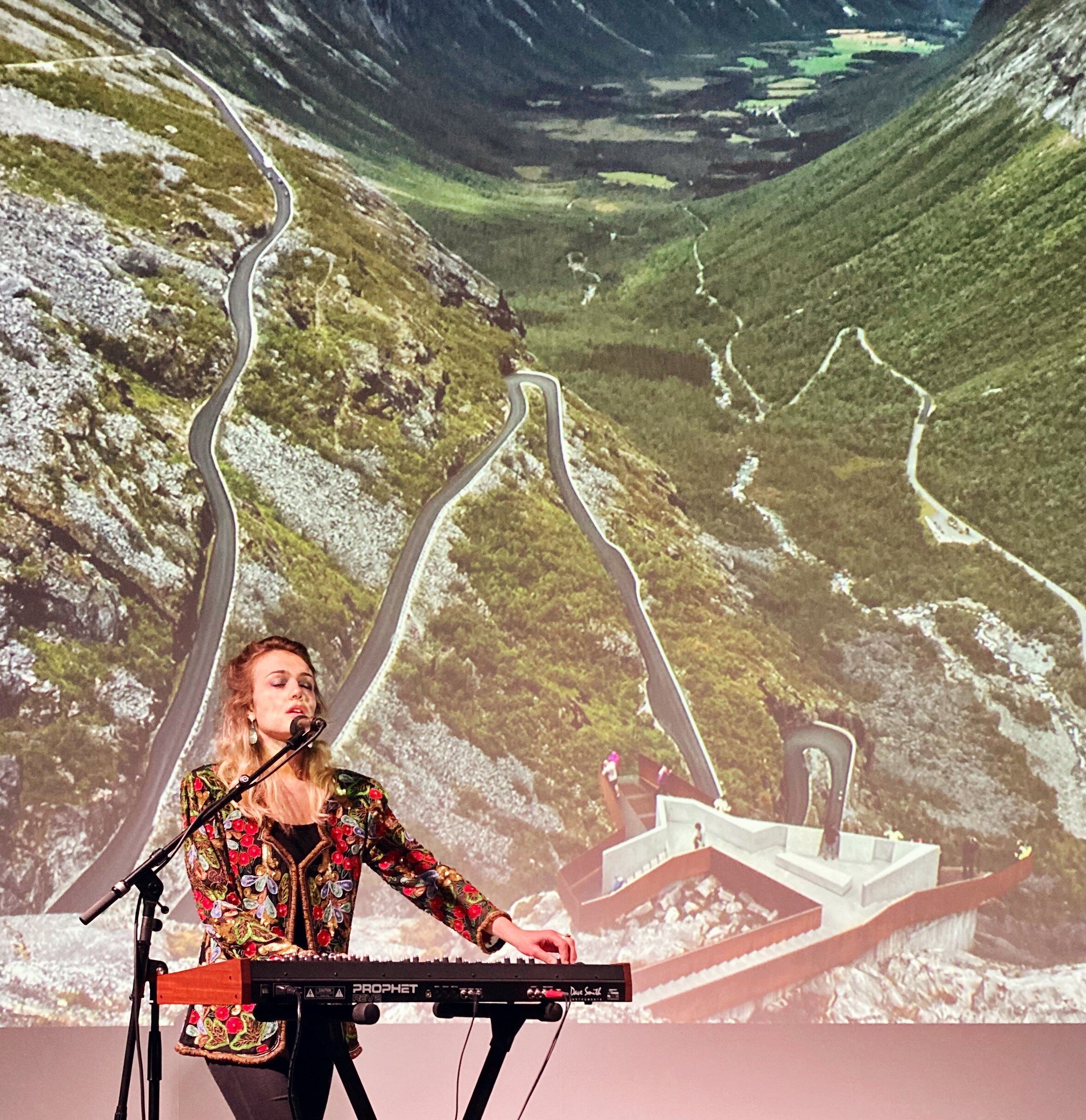
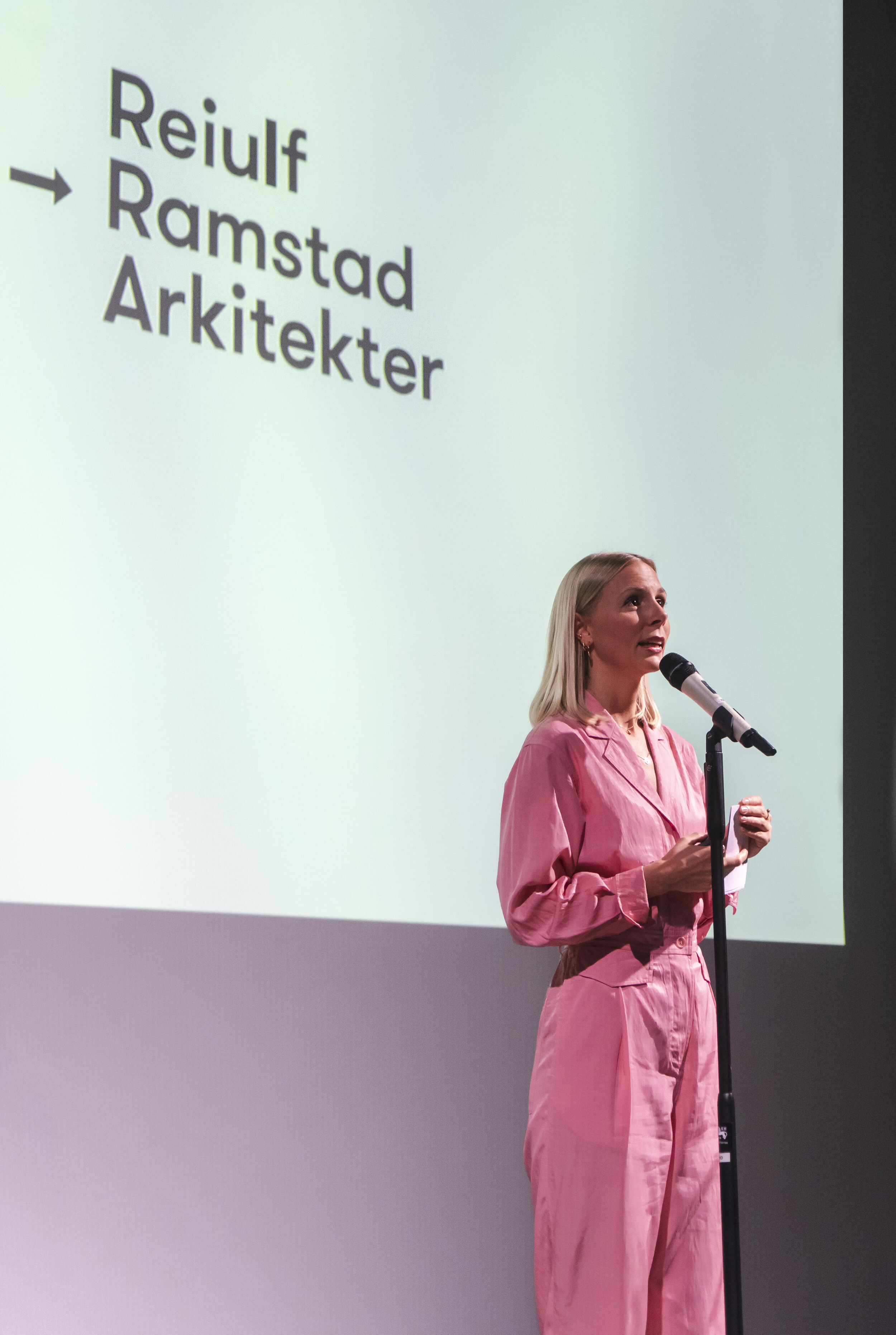
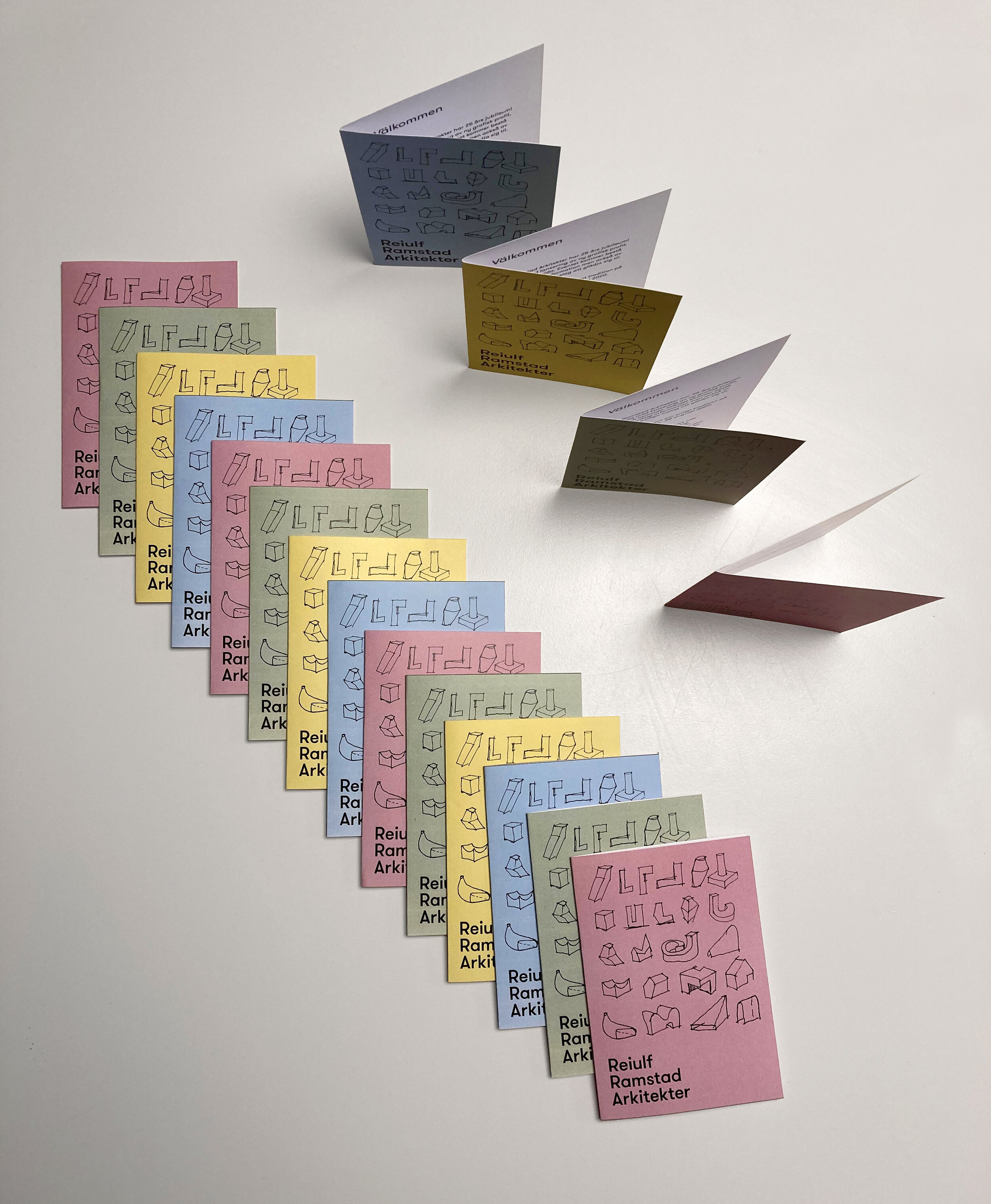
At Reiulf Ramstad Arkitekter we are happy to present our newly updated visual identity!
We wanted a consistent appearance to accurately present the firm as we are today. When developing our newest book Contours & Horizons in 2018, it sparked our inspiration to develop this in an updated graphic identity of the firm, and we continued this process together with graphic designer Troels Faber from NR2154/CPH.
The logo is now black, bold and assertive. The firm’s name will be presented uniformly as Reiulf Ramstad Arkitekter, proudly displaying our full name and Nordic origins. The changes also includes a new color palette; it’s positive, classic and inspired by natural elements. In addition to this we also included some graphical elements from sketches to play with.

