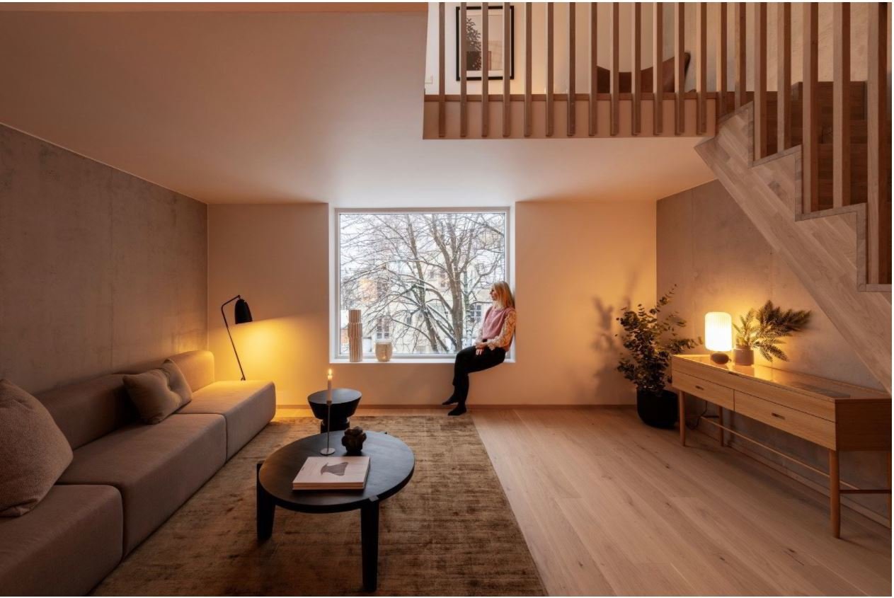
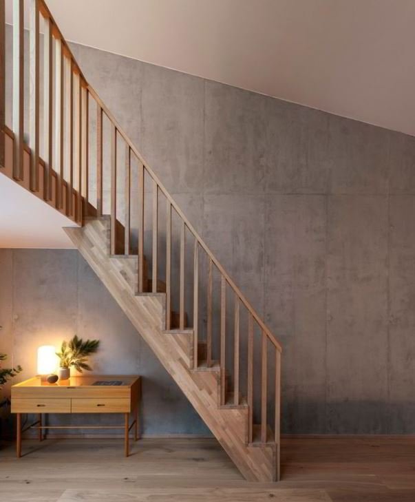
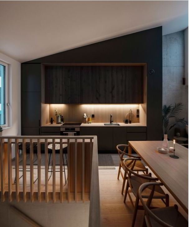
Picture by: Ivar Kvaal for D2
Three colorful townhouses in Oslo!
We were pleased to read about our recently finished project Sagene Trevare in the Norwegian magazine D2.
”The thing that hits you first is the colors. It goes in dusty shades of gray-blue, green and pink. Fresh and lush, but not at all foreign.
- All the colors can be found here in the neighborhood. We have walked around and collected them, taken samples, fine-tuned them, and given each house its own color. It will be pleasent for the neighbors to watch.
However, the use of color goes deeper than "nice". It does something with the reading of the building mass.
- The colors express playfulness. They help to create individuality, which is an important quality in a city. Here they also help to break down the building volume.
The three houses constitute the first stage of the project. Step two connects to the first, and will consist of three more colorful houses. Together, they will form a coherent building mass that differs in scale from the surrounding farms, but which also connects to them through their materiality and use of color.”


